Overview
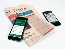
The mobile application had to deliver a high-quality user experience for their customers, enabling them to access a volume of real-time trading data and make high-value transactions. Users had not fully adopted previous attempts due to a more complex approach which had been not optimised for mobile.
By working collaboratively with the Capco team – using design sprint methodologies – we were quickly able to prototype essential journeys through the application to test functionality, discover what was best suited to the mobile platform, and deliver the most value to their customers.
This agile approach allowed their development teams to start building sooner. It ensured that the overall design empowered their users, and made them feel confident using the application to trade daily, while also being compliant with current regulations.
We worked together to define some of the critical elements such as ‘swipe to confirm’ for a trade (which seems not so impressive now – but at the time was a real signature interaction). We also facilitated several workshops with the Capco team, allowing us to quickly align the critical areas of focus and prioritise the work accordingly – bearing in mind the tight deadlines.
The application was designed for iOS first, and once fully agreed it was then quicker to rollout alterations for Android without double the effort when it came to inevitable changes.
Want to get nice& detailed?
Creating ‘signature interactions.’
Be creating a signature interaction we felt that we could make the trading process even more intuitive and straightforward, and give the bank an element that would be more exciting in a helpful way.
From this was born the ‘swipe to unlock confirm’. Once equity had been selected, the user could request a quote. Once this was given, they would have a limited time to commit – but a regular button press did not seem to weigh into the gravity of the transaction. At the same time, an accidental button press could potentially authorise a transaction for hundreds of thousands of dollars.
By requiring the user to swipe the button before it became activated, it not only solved this issue but added a gesture to the transaction that felt significant.
Drowning in Data
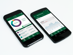
Trading equities is a very data-rich activity. Not only do you have to be able to pass data to a customer quickly, but it also changes in real-time when the markets are open. One of the critical things we needed to do was organise the data’s taxonomy into a UI that would allow quick access and present data-rich information in the right context on a small display.
On top of that, we needed to consider two types of key user – the average retail investor and the power user that trades frequently. Working together with the design team we centred on an IA that always lead to the trading modal, with shortcuts enabled for the power users to enable quick trades while skipping the detailed break down of single equities. We also used this to break up sections to give an obvious hierarchy to the information shown on each screen depending on importance and context.
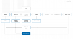
A simplified IA to focus on the trading process for both power and regular users.
nice& Impactful
This was one of those projects where it is needed to ‘be done yesterday’. The agile approach we took enabled the design to be agreed, rolled out as assets and moved into development in weeks rather than months.